Jamie
JamieFor years the Forerunner was easy to describe: a running watch. It tracked your runs, it lasted forever on a charge, and it looked like a piece of sports equipment because that’s what it was. Nobody bought one for the way it looked at dinner.
That framing is now out of date, and you can see it most clearly in something small — how much attention people pay to what’s on the screen when they’re not running.
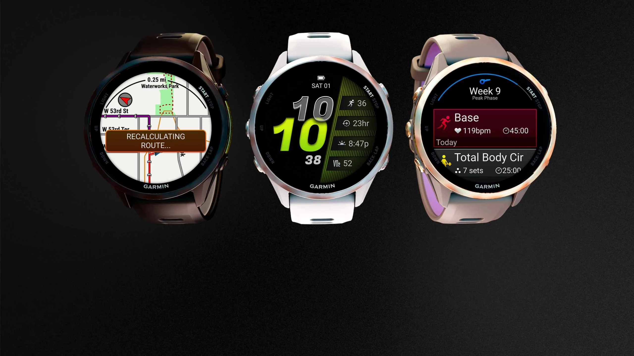
The AMOLED shift changed the question
The turning point was the display. Once AMOLED panels arrived in the mid-range Forerunners, the watch stopped being a device you glance at during intervals and became a thing on your wrist all day. A sharp, high-contrast screen invites you to care what’s on it. A dim MIP panel simply doesn’t.
That single hardware change moved the Forerunner into territory the Apple Watch and Wear OS have occupied for a decade: the watch as an everyday object. And the moment a watch is an everyday object, the face stops being a settings screen and starts being a design decision.
Two watches, two philosophies, same wrist
What makes the current line interesting is that Garmin didn’t pick a side. The lineup now spans both display technologies at once, and they ask genuinely different things of a face.
The MIP models still exist for a good reason — reflective displays get more readable in bright sun, not less, and they measure battery in weeks rather than days. But they punish delicate design: thin strokes and subtle colour gradients turn to mush, so faces need bold contrast to work.
The AMOLED models flip every one of those constraints. Deep blacks, fine detail, real colour — at the cost of battery, which is exactly why dark-background faces dominate there. It’s not an aesthetic trend; it’s power management wearing a style.
Why the model number matters more than you’d think?
Here’s where it gets practical, and where a lot of buyers get frustrated. “Garmin watch faces” is not a single category. Screen sizes, resolutions, and Connect IQ memory limits vary across the line, and a face built for one model can arrive on another cropped, misaligned, or refusing to install at all.
This is the part the marketing never mentions. Two Garmins sitting next to each other in a shop can be incompatible canvases, and the store doesn’t make that obvious until you’ve already installed something and watched it render badly.
So the useful search isn’t for a good face — it’s for a good face for your specific model. Model-specific roundups, like this one covering watch faces for the Forerunner 170, exist precisely because the generic lists don’t survive contact with the hardware.
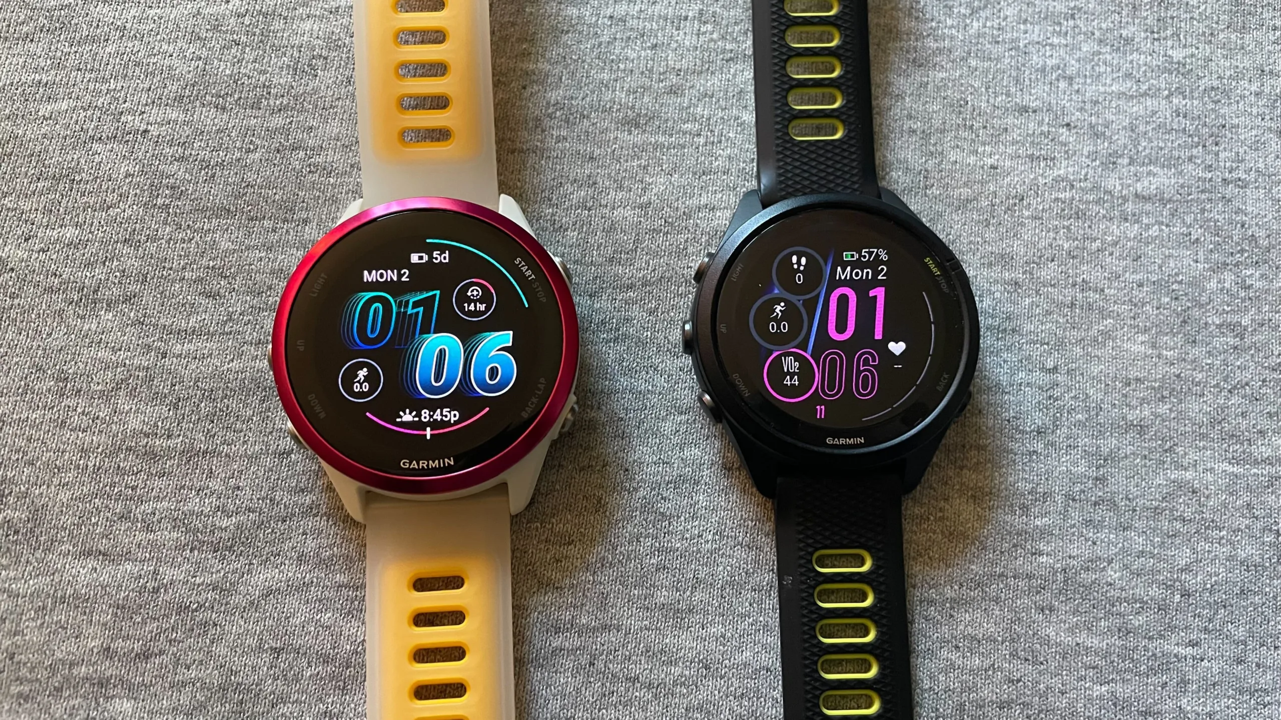
The quiet repositioning
None of this is how Garmin talks about itself. The marketing is still all VO2 max, training readiness, and recovery time — the language of a sports instrument.
But look at what owners actually do. They set up an activity screen once and then spend months tweaking the face they see every time they check the time.
That’s not runner behaviour. That’s smartwatch behaviour. The Forerunner became a smartwatch somewhere along the way, and the surest evidence is that people finally care how it looks.